
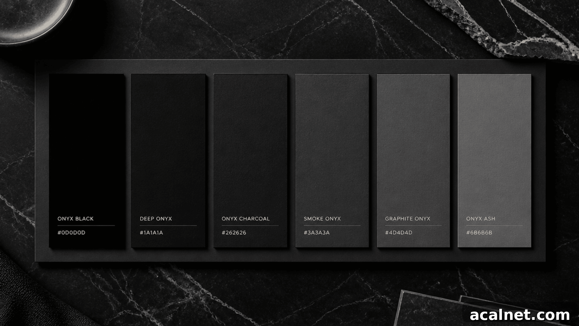
Ask ten people what color onyx is and most will answer “black.” The reality is more nuanced: onyx is a very deep black with subtle gray undertones, giving it a cool, muted depth that changes slightly depending on light and context.
Named after the gemstone, the color shares the stone’s satin-like richness. That restrained quality is why onyx appears across jewelry, interiors, branding, and product design—where a softened black communicates refinement without the harshness of pure black.
This article explains the exact hex code for onyx, how the shade reads under different lighting, practical uses in design and fashion, and color palettes that complement its tone.
What Color Is Onyx?
Onyx is a deep, near-black shade with a cool, grayish cast. The commonly used hex code is #353839, which produces a softer appearance than absolute black (#000000). That slight desaturation and coolness give onyx a calm, sophisticated presence that adapts well to both modern and classic applications.
The name derives from the onyx gemstone, long appreciated for its glossy dark surfaces and associations with strength and elegance. Historically the word comes from the Greek “onyx,” meaning “claw” or “fingernail,” a reference to the stone’s smooth, layered look.
Onyx Color: Hex Code, RGB, CMYK & Values
When you need precision for screens or print, these standard values help reproduce onyx consistently:
| Format | Value |
|---|---|
| Hex | #353839 |
| RGB | 53, 56, 57 |
| CMYK | 7, 2, 0, 78 |
| HSL | 195°, 4%, 22% |
| LRV | ~4 (very dark) |
| Pantone (closest) | Black 6 C |
Hex and RGB values are best for digital applications. CMYK is the format used for print. Pantone provides a standardized reference for consistent reproduction across vendors and materials—important when onyx is a core brand color.
How Does Onyx Look in Different Lighting?
Because it’s near-black, onyx responds noticeably to changes in lighting. Below are typical shifts to expect.
1. Natural Daylight
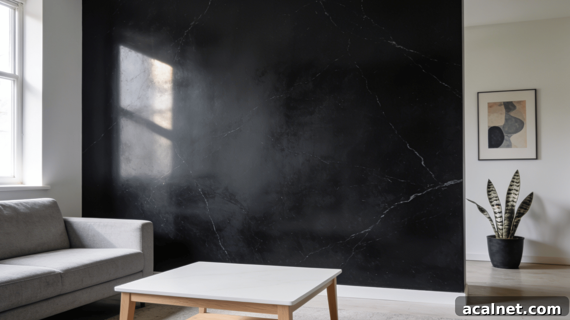
In balanced daylight, onyx shows its true character: a deep black base with cool gray undertones. Daylight reveals the depth without skewing the color warm or cool, making it a reliable reference when comparing shades for paint, fabric, or digital mockups.
2. Warm Indoor Lighting
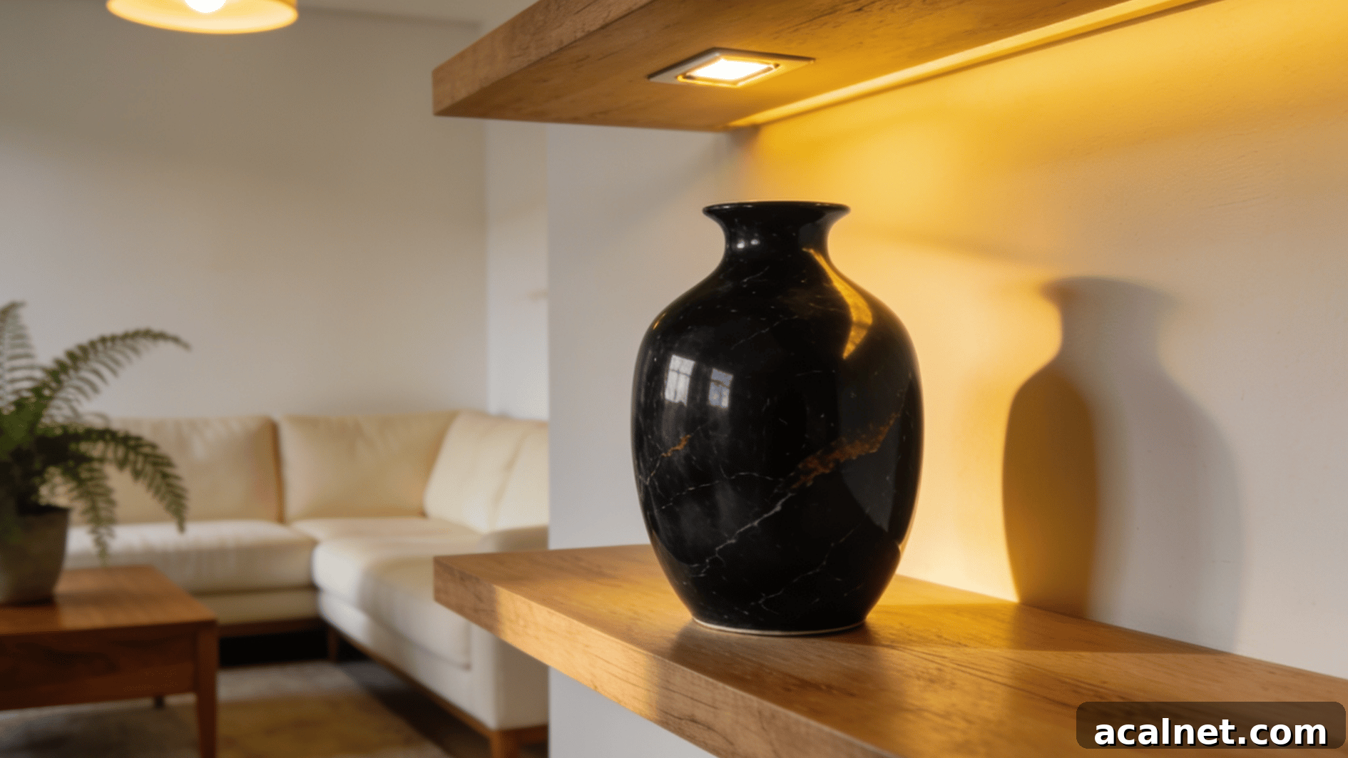
Warm, yellow-tinted lighting softens onyx and can coax out faint brownish or warmer tones. That shift makes the color feel cozier and pairs well with wood, leather, and textured fabrics in living spaces where a welcoming atmosphere is desired.
3. Cool LED Lighting

Cool, blue-leaning LEDs tend to emphasize onyx’s gray undertones, giving the shade a sharper, cooler edge. This effect can make surfaces appear crisper and more modern—useful for tech, retail displays, or contemporary interiors.
Ways to Use Onyx Color in Design
Onyx’s subtlety makes it useful in many design contexts where a softened black is preferred over a stark, pure black.
1. Digital Design
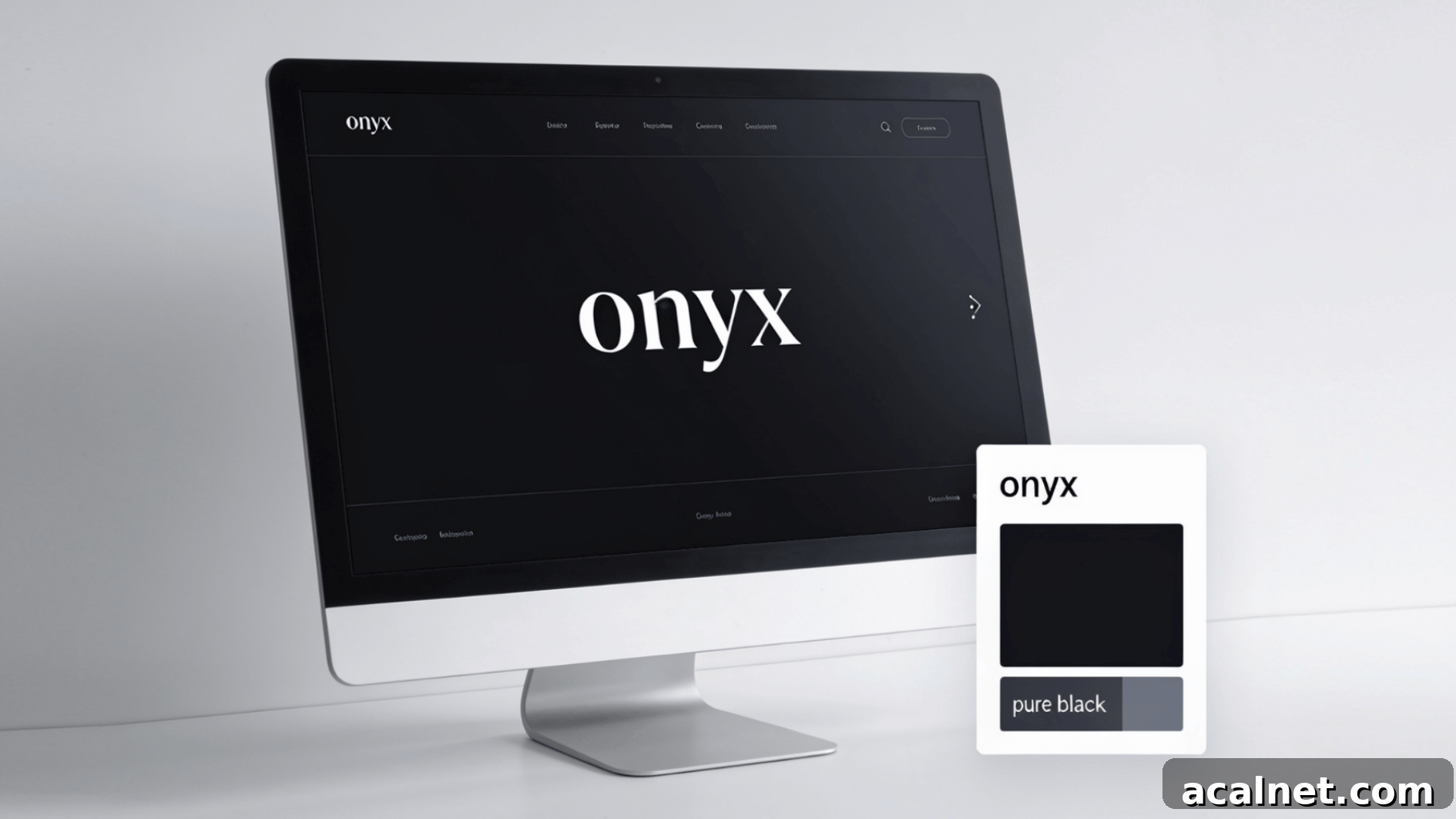
On screens, onyx provides high contrast without the harshness of absolute black. It works well for UI elements, typography on light backgrounds, and interface components where readability matters alongside a refined aesthetic.
- Offers strong contrast against white or light backgrounds while feeling less severe than pure black.
- Ideal for logos, headings, and accents where a premium, controlled appearance is wanted.
2. Fashion

In clothing and accessories, onyx adds a subtle luxury. It’s common in tailored pieces, evening wear, jewelry, and leather goods where a sophisticated black is preferred to a flat, high-contrast black.
- Works well with both gold and silver metals in jewelry.
- Chosen in garments and accessories for a softer, more intentional black.
3. Interior Design
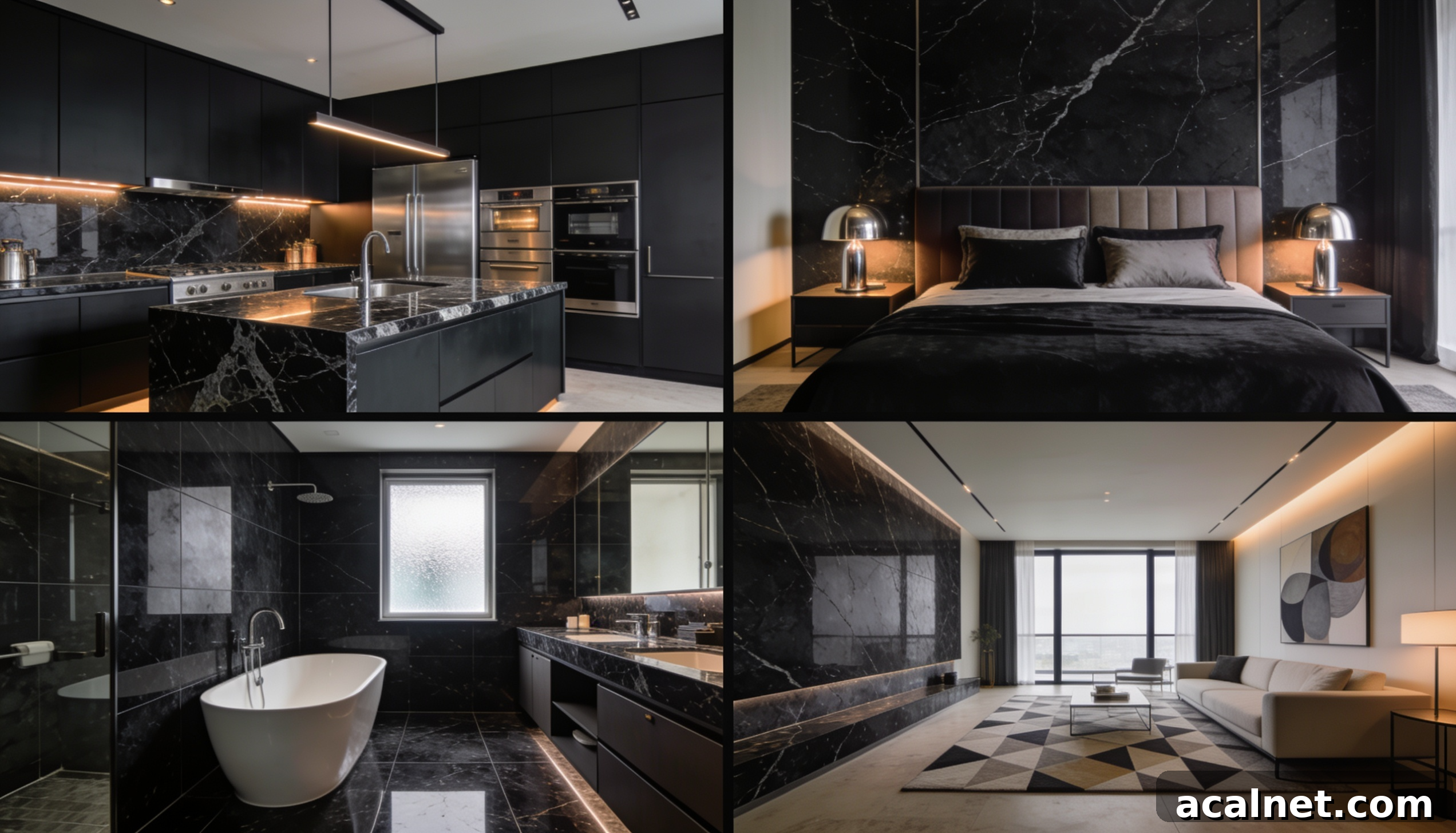
Onyx brings depth and calm to interiors. Balanced with proper lighting and lighter textures, it can anchor a room without overwhelming it.
- Bedrooms: bedding, headboards, and furniture for a tranquil, luxe feel.
- Kitchens: cabinetry, islands, and countertops to ground bright finishes.
- Bathrooms: tile and fixtures to add richness without closing in the space.
4. Branding

Brands use onyx to convey sophistication and restraint. It’s especially common in luxury, tech, and beauty sectors where a premium look is desired without loud or flashy colors.
- Performs well in packaging and product photography, capturing details without reflecting harshly.
- Useful for logos, business cards, and high-end product finishes.
Best Onyx Color Combinations & Palettes
Onyx’s neutral depth makes it highly versatile. Here are palettes that work particularly well and why they succeed:
| Color Pairing | Palette Feel | Why It Works |
|---|---|---|
| Onyx + White | Clean and high-contrast | White brightens the depth of onyx, producing a crisp classic look. |
| Onyx + Gold | Warm and refined | Gold brings warmth and shimmer that elevates onyx’s elegance. |
| Onyx + Silver | Cool and modern | Silver complements onyx’s cool undertones for a sleek finish. |
| Onyx + Emerald Green | Bold and jewel-toned | Emerald adds vivid depth while maintaining balance against onyx. |
| Onyx + Burgundy | Deep and dramatic | Burgundy introduces warmth and richness, grounded by onyx. |
| Onyx + Charcoal | Tonal and understated | Charcoal layers with onyx to create subtle depth without sharp contrast. |
| Onyx + Beige | Soft and balanced | Beige lightens the overall palette, keeping onyx from feeling too intense. |
Popular Onyx Paint Shades From Different Brands
Different paint brands interpret onyx slightly differently. Here are common takes to consider:
- Benjamin Moore: A near-true black with minimal undertone that reads consistently across lighting—good for doors, cabinets, and accents.
- PPG: A slightly cooler onyx with a stone-like quality, useful on larger walls in matte finishes.
- Behr: A warmer onyx variation with faint brown tones, cozy for living rooms and bedrooms.
- Dutch Boy: A lighter, cooler shade closer to dark slate—suitable for bathrooms and offices when a softer black is desired.
Quick tip on finishes: matte and flat create a modern, soft look and conceal imperfections, while satin and eggshell are more durable and easier to clean on frequently handled surfaces.
Onyx vs. Other Black Shades: Key Differences
Onyx sits between absolute black and softer grays. Small differences in undertone set it apart from related shades:
| Color | Hex | Overall Look | Undertone | How It Differs From Onyx |
|---|---|---|---|---|
| Onyx | #353839 | Deep black with soft depth | Cool to neutral | Softer than pure black, with subtle gray depth. |
| Jet Black | #252525 | Pure, intense black | Neutral | Darker and more intense, with little visible undertone. |
| Charcoal | #4a4a4a | Dark gray-black | Cool gray | Lighter and grayer, feeling more relaxed. |
| Ebony | #5d6658 | Rich black with warmth | Warm brownish | Warmer than onyx, with soft brown-black tones. |
| Obsidian | #0b0c0c | Very dark black | Cool | Sharper and glossier, more reflective than onyx. |
| Graphite | #474a51 | Dark metallic gray | Cool silver-gray | Grayer and slightly metallic; onyx is closer to true black. |
Conclusion
Onyx’s appeal comes from its adaptability. It can read cool and crisp beside silver, or warm and inviting next to gold. Its appearance changes with light and finish, making it feel less like a single fixed color and more like a small spectrum of deep black tones.
With the hex values, lighting notes, and palette suggestions provided here, you can choose the right onyx for a wall, a logo, or an outfit by matching the shade to the mood and setting you want to create.
Frequently Asked Questions
Is Onyx Considered a Warm or Cool Color?
Onyx is typically a cool neutral because of its gray undertones, though warm lighting can make it appear slightly warmer.
What Colors Are Similar to Onyx?
Similar shades include jet black, charcoal, ebony, graphite, and obsidian. Each shares darkness with onyx but differs by undertone and finish.
Why Is Onyx Named After the Gemstone?
The color takes its name from the onyx gemstone, known for its dark, glossy appearance and layered patterns that inspired the shade’s name.